Greater Twin Cities United Way
Challenge
The Greater Twin Cities United Way's website is used to reflect their organizational mission and make it easy for their primary audience to engage with the organization. Is it doing so?
Solution
After extensive research and user testing, a Findings & Recommendations report was provided along with a prototype of the recommended updates.
The Approach
METHODS:
Heuristic Evaluation & Analysis
Remote User Testing
In-Person User Testing
Prototyping
TOOLS:
Sketch
Axure
Trello
Lookback.io
GoogleDocs
Keynote
TEAM:
Phil Howe
Laurie Sugiarto
Traci Shellum
Jesse Wroblewski
Discover:
Identify a Baseline
Heuristic Evaluation & Analysis
The team began by individually conducting an evaluation of the site. Combined research showed a strong call to action for donating, combined with a quick and simple 3-step donation process.
Key site difficulties identified:
Site Navigation
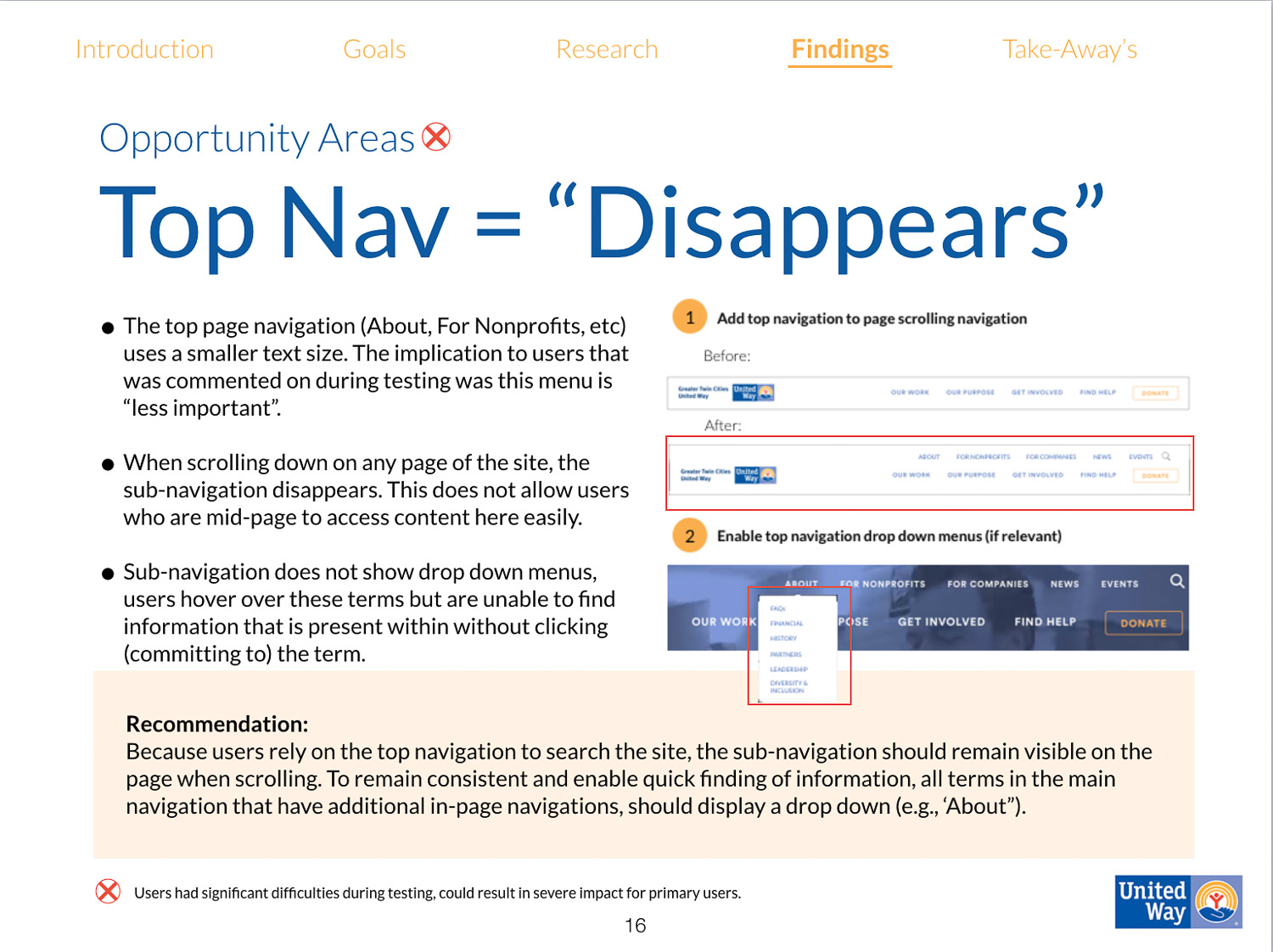
Double navigation bars - top disappears
Internal organizational terminology used
Content Structure
Multiple ways to arrive at the same destination
Volunteering/Events Processes
Differs from donation process
Involves a number of steps
Takes users away from GTCUW site
Discover:
Uncover Themes
In-Person & remote user testing
With these initial insights, our team created a research protocol focusing on the key site difficulties. This protocol guided in-person and remote user testing. From these tests our team discovered the following:
Working Well:
Clarity surrounding GTCUW's primary functions
Connection between 'Get Involved' and 'Volunteer'
Clear call-to-action for donations
Opportunity Areas:
Navigation terms were not understood
Locating specific information was challenging
Participants that were re-directed off the GTCUW website expressed surprise and moderate confusion
“It’s organized by their programs rather than someone who doesn’t know what is going on, what a giving community is, how it works... It makes it harder for them...”
Evaluate:
Recommendations
The client space was taken into generous consideration when preparing the final report. Breaking down large, time consuming site modifications into smaller, incremental steps that offer significant returns was the key focus of this report.
*Extended recommendations were also provided.
Taking it further
View a prototype of the site addressing the below recommendations:
Consolidation of main page navigation to one line
All navigation terms have a drop down menu (if landing page has more in-page navigation)
Interactive GTCUW 'At-A-Glance' infographic
Pop-up notifying users of external site re-direct
Pop-up notifying users they have been added to the newsletter mailing list


